You have 10 seconds.
That’s amount of time your landing page has to capture the attention of prospective consumers. In 10 seconds they will decide if they will fall in love with you or leave you on the side of the highway with a pile of your belongings. Once they’re gone, they’re gone. There are many reasons to use a landing page in your marketing strategies. A well planned and executed page can:
- Generate leads
- Improve your search engine optimization
- Build brand awareness
- Collect demographic information
- Track which prospects are more engaged
- Grow your social tribe
So what exactly is a landing page?
A landing page is a single web page that allows you to gather a visitor’s information through a lead-capture form, it can live on your existing website or have its own domain/URL.
It’s an indispensable part of your marketing plan.
So how do you secure the attention of your target market before they run into the arms of your competitor?
It all starts with a KISS: Keep It Simple, Sally!
Landing Page Success in Four Simple Steps:
1) Define what it is that you want.
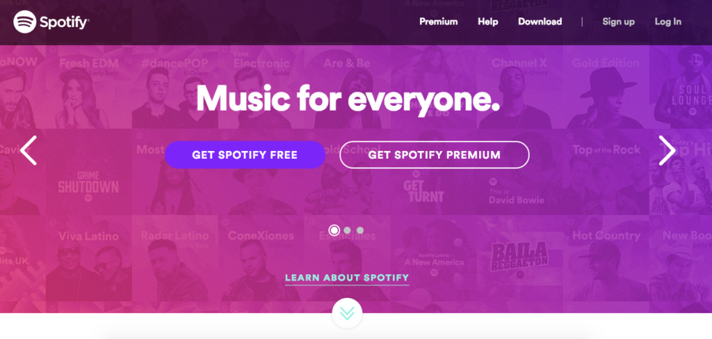
What’s the purpose of your landing page, and what is its most important business function? Once you determine that, you’ll be able to design your page accordingly. Check out how Spotify keeps things direct. Notice how they put their primary function front and center- getting you to sign up.
2) Clearly convey your value.
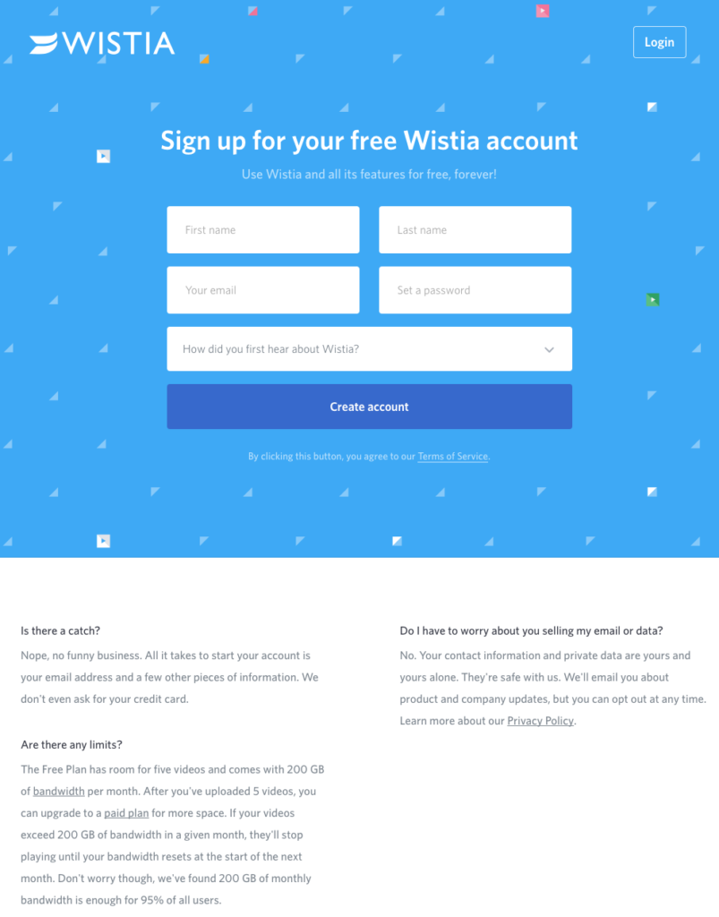
A great example of this comes from Wistia, a video software company that allows businesses to create, host and analyze metrics on their marketing videos. By creating a headline with an obvious call-to-action, “Sign up for your free Wistia account” and defining their value, “Use Wistia and all its features for free, forever!” as the sub headline they are making a guarantee that their product will not only serve your needs forever but also that there is a bucketload of features (value) waiting for you on the other side of the sign-up form.
Then, just when you think it’s too good to be true they predict any concerns you might have and immediately address them with a clean and short FAQ’s and answers section. By doing this, Wistia is solidifying their brands’ no B.S. approach and building trust with their potential clients. It shows they understand their customers, their pain points, and how to provide a solution to their concerns to push them forward in the process.
3) Distraction free design.
That is, putting too much on your page and pulling your visitors attention away from the purpose of your site.
Make it simple, but significant.
-Don Draper
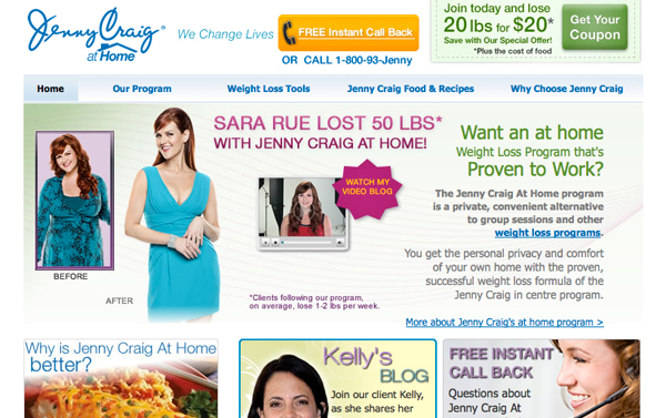
Consider this example from Jenny Craig. Your eyes are being diverted to so many different places that it’s nearly impossible that visitors would be able to figure out how to sign up, especially within the first 10 seconds! Instead of making your buttons and logos bigger to make them stand out on a busy page, consider instead cleaning up your site and focus your design on directing the viewers’ attention to the most important function- the purpose of your page. Limiting the decisions that a visitor can make allows you to lead them to the outcome you desire.
4) Clear call-to-action.
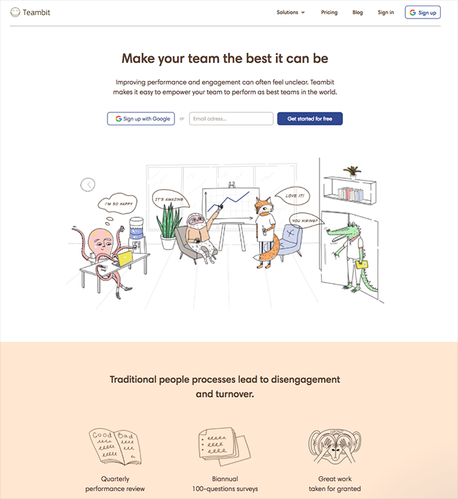
If you’re a leader looking to improve the performance of your team, you’d probably feel safe signing up with Teambit given their clearly defined call-to-action: Make your team the best it can be by putting your e-mail address in this box. Or, even easier and more conveniently, you can sign in with one click with Google. The fun characters (who are all so happy to be working with Teambit, if you didn’t notice) lend a glimpse into what an experience with using these services would be like; delightful, light, and open with a touch of whimsy. They go on to state what the problems with traditional processes are which give value to the statement that Teambit can make your team the best it can be.
Your landing page is the gateway to your potential clients and consumers. While each may serve a different purpose it’s a powerful way to improve your SEO, build your brand, and generate leads. In fact, according to WSI World, 68% of B2B businesses use landing pages to generate leads for future conversion. Is your landing page meeting your needs? If not, a great place to start is to take a step back and experience it through your viewer’s perspective.


