Amazon has aggressively tried to expand its hold on various markets for quite some time. Case in point: tablets (Kindle family), gaming (Twitch.tv, controllers, OnLive game system), and phones (Fire Phone). [September 2017 update: and now groceries to compete against Target and WalMart with the purchase of Whole Foods for 13.7 billion dollars.]
Let’s focus on the phone.
Earlier this year they launched their own mobile phone: Amazon Fire Phone for $200. Two months later, Amazon announced they were slashing the price to 99 cents. Many argued that it was a deft business strategy to get the device in more hands and boost revenue of their apps or in-device marketing value similar to how magazines offer free subscriptions to boost subscriber count and increase advertising costs. Others, like comScore, argued that the device had very limited sales, somewhere in the realm of 35,000 units, and they were just trying to get them out the door.
Earlier this week Amazon announced a $437 million loss in earnings. How much of that was due to the Fire Phone? 5 million? 50 million? 150 million?
Amazon lost $170 million this year due to the Fire Phone.
According to Techcrunch, Amazon has $83 million in Fire Phone inventory sitting on its shelves. The investors from Shark Tank would be livid.
Regarding stocking up on too much inventory: “First, you’ve put yourself on the hook to pay for all those units, even though you have no guarantee of revenue. Second, you now have the additional burden of paying for storage. Third, when you order your inventory too soon, you’re wasting the money you paid for your prototype because you’re undermining one of the main reasons you got it in the first place — to conduct your market research.”
– Lori Greiner, Entrepreneur.com interview
Why tell you all of this?
We’re going to wrap the economics of business into a behavioral marketing / user experience perspective for a moment.
Amazon.com launched a redesign of their website this week. Aside from shifting elements around on the page, like they often do with A/B testing to bolster their eCommerce conversions, they placed their failed product front and center on the navigation.
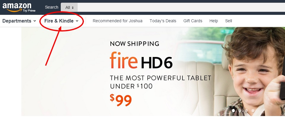
Amazon Fire: the product that lost $170 million dollars
It may seem like sound business logic…until you actually put some thought into it.
Amazon.com is highly regarded for what they do with user experience data. They perform an incredible amount of A/B testing and user testing in general. That’s why they’ve grown to be the $20.58 billion company that they currently are. They get it. Many startups, or cash-strapped consultants, reference what Amazon is doing in the eCommerce space and then repackage that “strategy” as their own to sell to clients.
That’s fairly common. Sadly.
What happens when Amazon begins using more aggressive tactics that betray the solid foundation of user testing? They become a shiny version of the pushy cold call marketers you hang up on each day. The ones that start phones calls by saying, “Don’t hang up. This isn’t a sales call.”
Now those consultants (ie: “gurus”) see this as valid strategy. To push whatever you want down the throats of your potential consumers. You know. Because revenue. At Candorem we’ve coined this the “Amazon Effect”.
What they don’t understand is that all decisions related to digital marketing, which includes web design changes, need to be vetted. Look at your data. Review the analytics to see what people want. Make their journey easier. Cut out the extra clicks to get them into the checkout page. That’s how you increase revenue. Provide a solution to your customer.
But doesn’t Amazon customize the products you see based on your past purchases? You know, providing a segmented solution to each user?
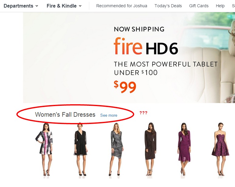
Amazon.com: segmented marketing failure
Forced User Behavior: UX Nudges
They used to do that very well. But with this new redesign it seems to have taken the back seat to what they want to push to you. Look at the image to the right. The first thing I see is “Women’s Fall Dresses”. First, I am not a woman. Second, I have never looked a women’s clothing or purchased any on Amazon.
This goes against the basics of Behavioral Marketing 101.
So why is Amazon ignoring the qualified user experience data they’ve collected?
I understand some men may purchase female clothing or that some men may purchase female clothing for their significant other. But why wouldn’t Amazon showcase products I’ve shown interest in but haven’t purchased yet? Or products I have purchased and may need to refill or buy a new version of soon?
Instead, they push women’s fall dresses. If the goal is to buy something in season related to women why not show dresses if the user is a woman but then show simple low-friction purchases like accessories for men to purchase for them?
I’m curious how may men purchase a women’s fall dress. That should be the deciding factor and it’s possible that the answer is: enough to warrant this design decision. We do not have access to the data to validate it.
Amazon is forcing you into departments they want you to be in.
Hard Data: Market Share for Amazon Fire
Amazon Fire Phone sold roughly 35,000 units through the end of August. Let’s be generous and bump it up to 100,000 units to make this easy and hopefully more relevant to what their figures are at, at the time of publishing this.
Based on this Forbes.com article detailing the estimated Kindle E-Book sales for Amazon, there were roughly 43.7 million Kindle units sold from 2007 to the end of 2013. It could be much lower or possibly higher but that doesn’t matter for this argument.
Based on Amazon.com traffic data from Quantcast they are seeing roughly 80,000,000 people visit the site per month.
That means that roughly .00125% of visitors own a Kindle Fire Phone while, potentially upwards of 54.625% own a Kindle E-reader.
Wouldn’t logic dictate that the Kindle should be first on the drop down list? Less effort to locate relevant accessories, products, and e-books means revenue.
It takes an extra second to locate the Kindle product line. That may not seem like much to you but Amazon received a lot of press for their “Users really respond to speed” presentation in 2008. They stated that for every 100ms of latency it cost them 1% in sales. That’s .1 second. Ten times less than it takes to navigate to the Kindle E-reader. Ten times less than something that has an install base 43,700% greater.
Could we extrapolate that the momentum of a user’s intent to purchase is impeded by the choice of navigational structure?
Latency in page load versus resistance because of design decisions are very similar to a user’s overall experience.
Priority should always be focused on providing the path of least resistance to the end goal.